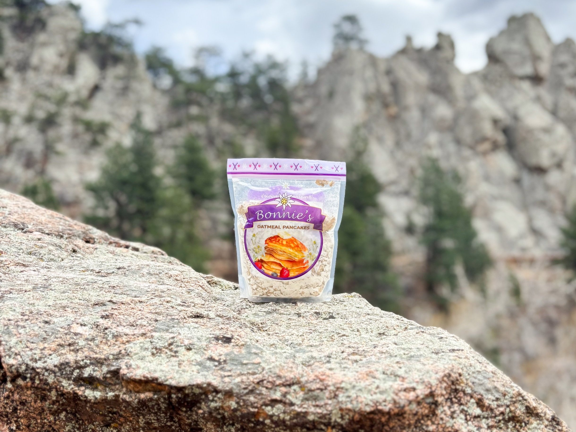
Home of Bonnie’s famous oatmeal pancake!
Bonnie’s Pancakes
ROLE: CO-FOUNDER & DESIGNER
Anyone who’s had the chance to ski Aspen Mountain has probably tried Bonnie’s famous Oatmeal Pancake AKA the best pancake you will ever eat!
Bonnie’s Pancakes is a real company founded by Annika Nichols and myself. Currently we have ordered our first batch of packages and will be prepping the mix in Bonnie’s commercial kitchen soon.
My role at Bonnie’s Pancakes has been to design eye-catching packaging, a user-friendly website, branded merch, as well as a social media strategy that all tells Bonnie’s story and stays consistent in brand image.
About Bonnie’s Pancakes
Since the 1960s Bonnie’s Restaurant has been a local staple on Aspen Mountain. Located mid-mountain, this ski lodge transports you back in time. With world class views, food, and service, Bonnie’s has it all!
Locals, ski bums, and celebrities from all over the world have dined at Bonnie’s. And what’s the dish that skiers just can’t get enough of? Bonnie’s famous oatmeal pancakes.
The demand for these pancakes creates long lines at Bonnie’s Restaurant and disappointed skiers when guests can’t place their order before the 10:45 cutoff.
So Bonnie’s Restaurant owner Brigitte Birrfelder and her daughter Annika Nichols knew the only way to keep crowds out of Bonnie’s was to bring the Pancakes to them. After hours of experimenting with the dry-mix recipe, Bonnie’s Pancake Mix was born!
Packaging design
My design objective for the mix packaging was to create an instantly recognizable design that told Bonnie’s story through both text, colors, and graphics.
DESIGN DIRECTION:
Incorporate the Swiss heritage of Bonnie’s restaurant. I achieved this through imagery of the Edelweiss flower, skiing graphics, and mountain motifs.
COLOR STORY:
White and yellow colors from the Edelweiss flower and shades of purple from the Columbine. Pairing Bonnie’s Swiss heritage with Aspen mountain's ski culture.
EXPERIENCE:
Playful, intuitive, inviting
Social media & web design
My strategy for designing Bonnie’s web presence was to celebrate the playful packaging design, but elevate it with a more “sophisticated” color palette.
By pairing the pastel purples in the packaging design with a deep sea blue and off-white, the website is not only easier to navigate, but will appeal to a wider audience.
The website also utilizes negative space to help guide users eyes through the page and lead them to clicking buttons to learn more.


